reimagining the travel booking experience
Redesigning a responsive website

Project Overview
This project explores opportunities to improve JetBlue’s flight booking experience by focusing on clarity, efficiency, and user confidence during high-decision moments.
I chose JetBlue as a case study because flight booking flows are information-dense, time-sensitive, and prone to user frustration, making them well suited for evaluating research-driven UX decisions and iterative design.
The goal of this project was to identify usability issues in the existing experience and design improvements grounded in user research and testing.
Role
UX Designer
Platform
Mobile & Web
Timeline
3 weeks, February 2022
Project type
Self-initiated UX case study
Problem Definition
Booking air travel is a high-stakes, time-sensitive task where users are required to compare complex information quickly. During early evaluation of JetBlue’s booking experience, it became clear that confusing hierarchy and dense presentation made it difficult for users to confidently compare flight options and make efficient decisions.
This project focused primarily on:
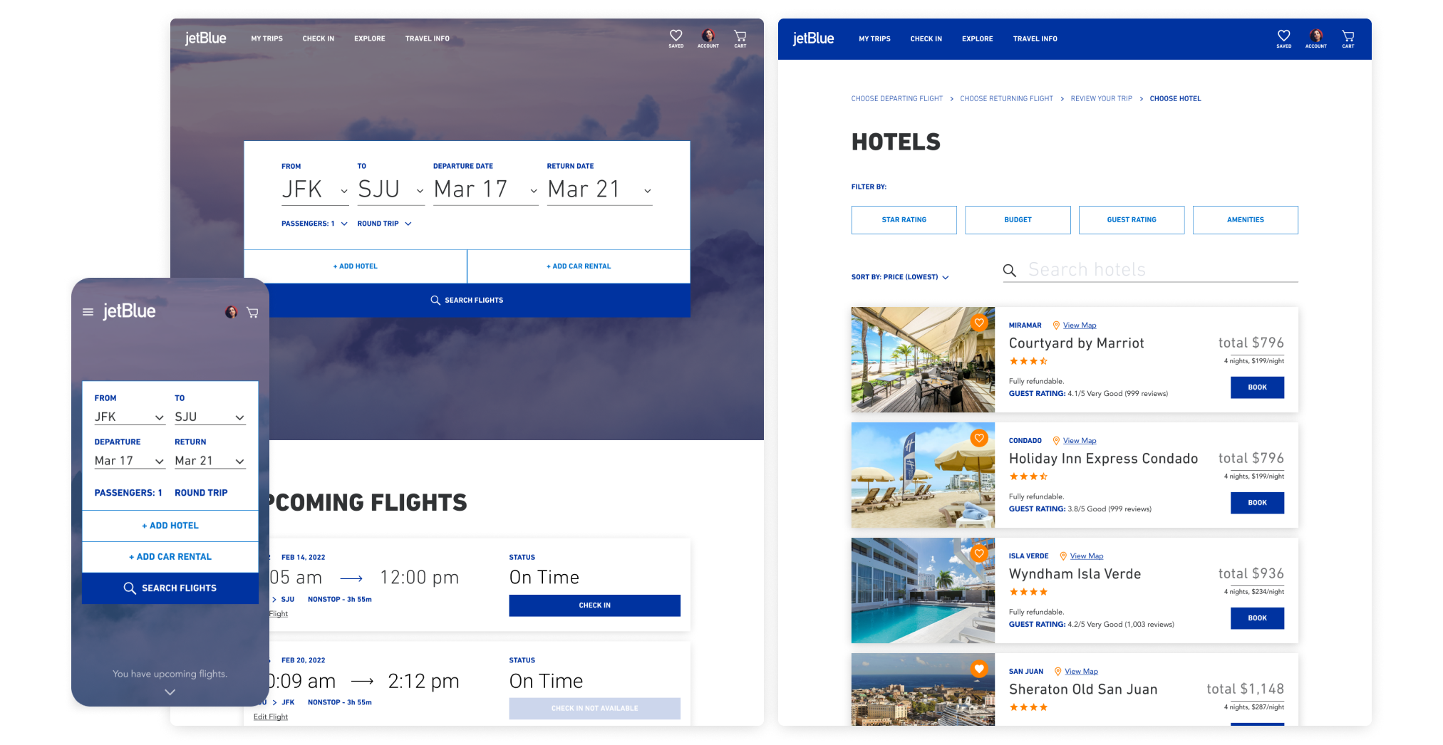
Flight search and selection
Optional hotel selection during booking
A secondary seat selection flow was explored, but the primary design emphasis remained on the areas where users experienced the most friction.
The overarching goal was to reduce cognitive load and improve decision-making confidence by clarifying information hierarchy and aligning the experience with users’ primary booking goals.
Research & Methods
To better understand user behavior and decision-making during travel booking, I conducted a combination of qualitative and evaluative research methods:
User interviews to understand priorities and decision criteria when booking flights
Usability testing of the existing experience to identify friction points
Competitive analysis to evaluate how other travel platforms structure flight comparison and selection
Across all research methods, a consistent pattern emerged:
Users want to find reasonably affordable flights that minimize total travel time, and they expect booking interfaces to support fast, confident comparison.
Key Research Insights
Research and testing revealed three key insights that directly informed the redesign:
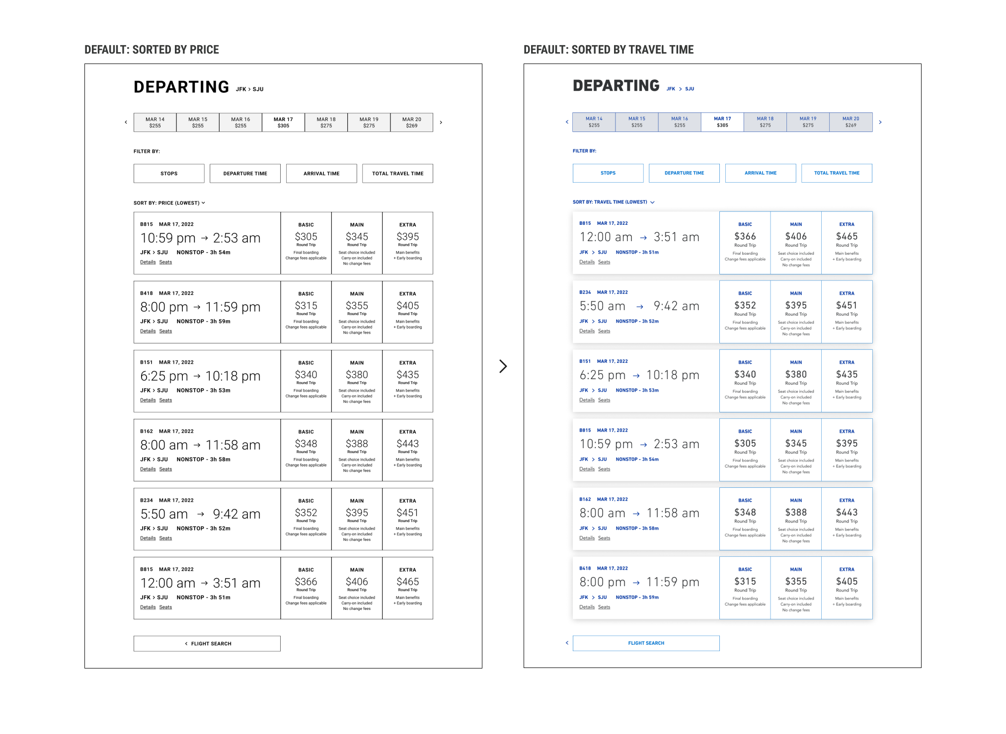
Users prioritize total travel time over price when comparing flight options
Participants consistently chose to sort results by shortest travel time, indicating that efficiency and convenience outweighed marginal cost differences.Clear tiered seating options reduce decision friction
Presenting three seating tiers directly within flight listings, along with concise benefit descriptions, helped users more quickly understand trade-offs and commit to a selection.Location is the primary driver for hotel selection decisions
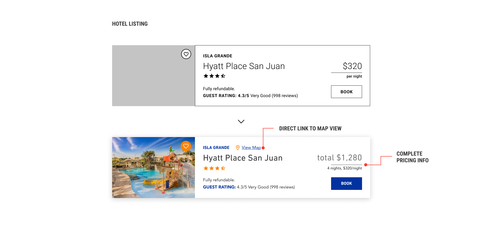
When evaluating optional hotels, users consistently prioritized proximity and location over secondary features, suggesting the need for stronger visual emphasis on geographic context.
These insights highlighted the importance of clear hierarchy and decision-oriented presentation in travel booking experiences.
Additional research insights acquired through user interviews allowed me to define these two distinct user personas that I would use to guide my design strategy.


Design Strategy & Key decisions
The redesign focused on translating research insights into clear, decision-oriented interface changes that reduced confusion and supported faster, more confident booking.
Prioritizing travel time in flight results
Based on research and low-fidelity prototype testing, showing that users consistently prioritized shorter total travel time, flight search results were designed to default to a time-efficient sorting model. Visual hierarchy emphasized total flight duration, allowing users to quickly identify the most convenient options without excessive comparison.
Clarifying seat selection through tiered options
To reduce friction during flight selection, seating options were presented as three clearly defined tiers, each with concise benefit descriptions. Displaying these tiers directly within flight listings helped users understand trade-offs earlier in the process, reducing uncertainty and decision fatigue.
Emphasizing location in hotel selection
Because location emerged as the primary factor in hotel decisions, the hotel selection flow was designed to highlight geographic context. Map visibility and location-based cues were prioritized to help users quickly assess whether a hotel aligned with their travel needs.
Together, these design decisions addressed the core usability issues identified during research, confusion and poor hierarchy, by aligning the interface with users’ mental models and booking priorities.
A simple task flow to test the prototype’s design concept.


Usability Testing & Iteration
Following initial design exploration, I conducted usability testing on the redesigned flows to validate assumptions and identify remaining friction points. Feedback was synthesized using an affinity mapping exercise, which helped surface recurring themes and prioritize the most impactful changes across navigation and information hierarchy.
Key iterations informed by testing included:
Flight search sorting
User testing confirmed that price-based default sorting increased comparison time and confusion. During testing, users’ first action was often to sort search results by travel time. Based on this insight, the default sorting was changed from price to shortest total travel time, better aligning with user priorities.Hotel selection clarity
Users expressed uncertainty around how many nights they were booking and the total cost of their stay. In response, the hotel listing module was updated to display length of stay and total price upfront, along with an option to view the hotel’s location on a map, which users consistently requested.Seat selection flow adjustment
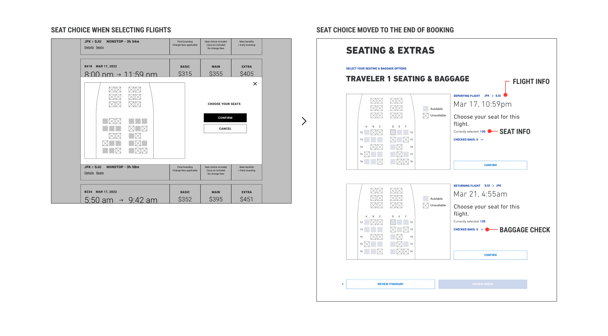
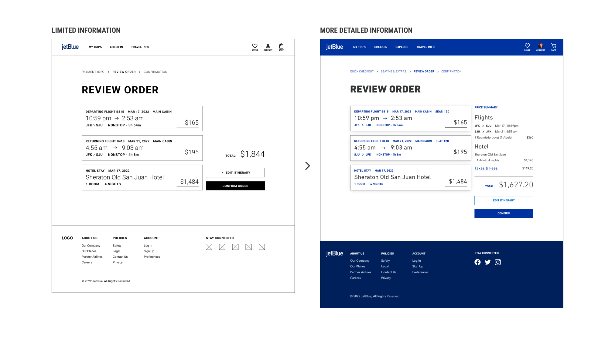
The seat selection step was moved to the end of the booking flow to avoid introducing time pressure early in the process. This screen was also expanded to allow users to select additional baggage options within the same step, reducing unnecessary back-and-forth.Review Order improvements
Testing revealed that the final review screen lacked essential details needed for user confidence. The “Review Order” screen was expanded to include a clear breakdown of each flight and hotel selection, with improved visibility into pricing, taxes, and fees before confirmation.
These iterations helped reduce uncertainty at key decision points and reinforced user confidence throughout the booking experience.
Outcome & Reflection
This project demonstrated how research-driven iteration can meaningfully improve complex decision-making experiences. By grounding design decisions in user testing and continuously validating assumptions, the redesigned flows reduced confusion and better supported users’ primary booking goals.
Through this case study, I strengthened my ability to:
Translate qualitative research into actionable design priorities
Use synthesis methods, such as affinity mapping, to guide iteration
Design booking flows that balance business requirements with user confidence
Improve information hierarchy in dense, multi-step experiences
This project reinforced the importance of designing for clarity over novelty, particularly in high-stakes environments where users need to make informed decisions quickly.