helping users stay organized and collaborate at home
Creating an End to end Application

Background
For this project, I was tasked with creating an MVP for an end to end mobile application.
As a UX designer I was tasked with exploring a concept for a new business based on an idea for a new lifestyle app. This application intends to help users manage and organize their grocery lists and pantry inventory and provide them with valuable and relevant information to help them shop better and smarter.
Role
Research & UI/UX Design
Timeline
6 weeks, March 2022
Problem
Users find grocery shopping frustrating due to a myriad of annoyances such as increasing prices, forgetting important items, and unfitting portion sizes for certain items. These problems cause further frustration in the kitchen when the user finds that they’re missing items they need or are forced to throw out large amounts of spoiled or forgotten food.
Objective
Design an MVP for a mobile lifestyle app that helps users in a collaborative environment to more efficiently and effectively conduct their grocery shopping and manage their kitchen space.
Learning from experience
During this first research step, I wanted to learn about my users so I could identify the problem that my app would solve for. To do this, I began by conducting user interviews with users of varying demographics. These were three interviews conducted remotely consisting of a series of questions aimed at learning about the users’ grocery shopping habits.
Some questions asked were:
How often do you shop for groceries?
Do you have a shopping list? How do you use it?
How often do you throw out spoiled food?
A few key points
I was able to identify a few key insights that helped me define the product I wanted to build.
I found that users rely on visually identifying the items they need within the store, so they tend to forget to purchase things if they don’t spot them during their trip.
They also have issues buying appropriate portion sizes. In the case of smaller families, like couples with no children, items are sold at portions too large for their household. This leads to more wasted food.
Finally, I found that many users are being affected by inflated food prices and are finding themselves being more careful about their expenses.
With these insights, I was able to identify the problems that my product would solve for.
Defining the product
There were two distinct solutions I wanted to provide:
A way for users to better keep track of items they need to purchase, making it easier for them to make sure they acquire everything they need during a shopping trip.
A way for users to better keep track of and manage the items they currently have that would store relevant information for each product in a simple and easy to use interface.
Additionally, I wanted to provide a social product that could be used by multiple users within a household, so both of these solutions would be developed as collaborative features.
Who is it for?
Next, I set out to craft an appropriate foundation that would help structure my design process and would make it easier for me to define my product. I started this by creating a user persona based on the key characteristics of the users interviewed during the research step.

The two main features
After brainstorming as many possible features this product could have, I made a priority list to help me find the MVP needle in the proverbial haystack. I then narrowed it down to two major features that would complement each other:
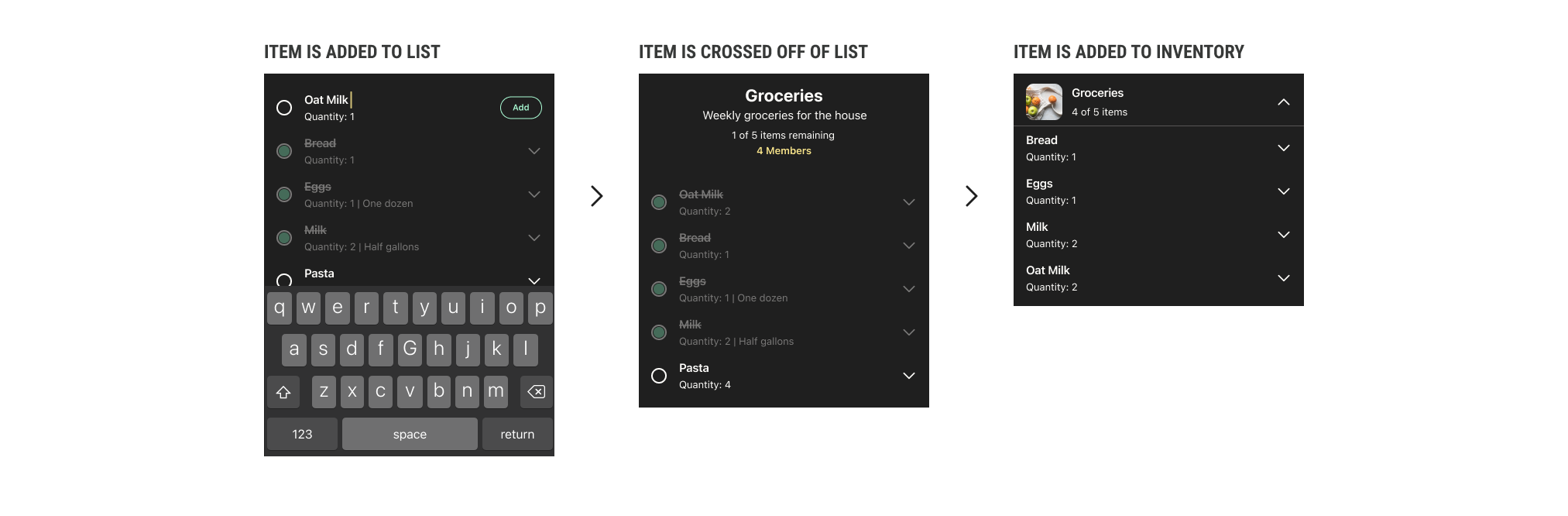
The lists feature, which would allow users to create shopping lists, add items to them, and cross them off as they are acquired. These would be running lists that one could add to or edit to keep current.
The inventory feature, which would be a breakdown of the user’s current inventory of items. If an item were to be crossed off a list, it would appear in the user’s inventory. Here, they could also see relevant information on the current state of the item, such as the purchase date of the item, its expiration date, and any additional information they chose to keep track of.
These features would work together to create a collaborative space for friends and family to organize their kitchen pantries.
In this user flow, I map out these two features and how a user would go about interacting with them.
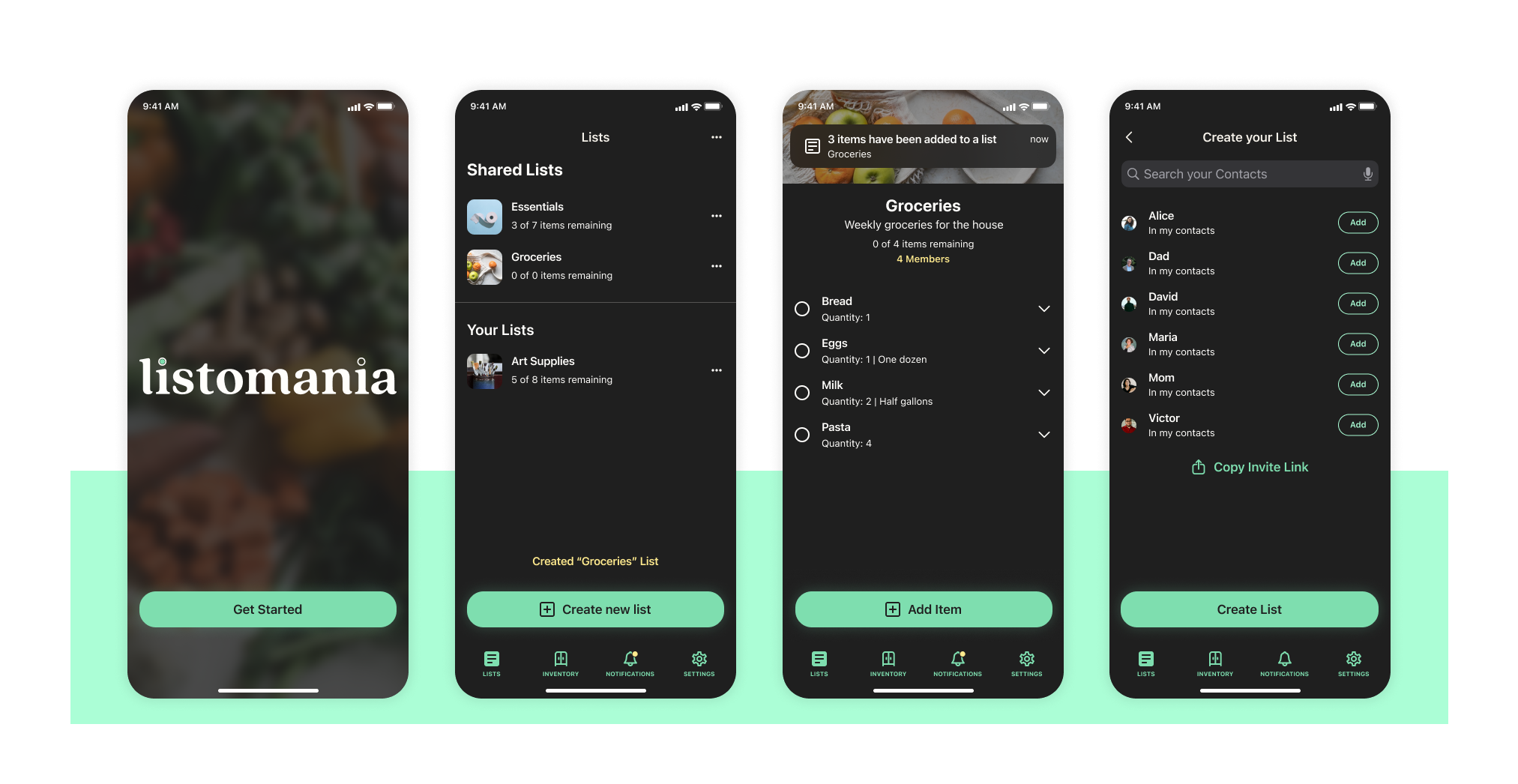
Designing for Mobile
Before developing a prototype for usability testing, I designed low-fidelity wireframes to establish the main tasks that testers would conduct. The main backbone of the product can be seen in these screens.

Testing early
It would be best to create a limited prototype at this stage to test the usability of the design as soon as possible. This would help me evaluate the effectiveness and understandability of my initial concept and allow me to adjust the overall design before putting too much work into it. To do this, I developed from my wireframes and created a flow with two short tasks for users to conduct.
The prototype was tested by four users. Three were done remotely and one, in-person. The assigned tasks were as follows:
Creating a list.
Adding an item to the list.
Adding an item to the Inventory.

Key Findings
The design failed at communicating to users the intended purpose of the two main features and how they worked with each other.
During the third assigned task, testers were told that they had acquired an item and needed to add it to the Inventory.
4 out of 4 testers did not initially realize that items could be added directly to the inventory and instinctively tried to add it to the list they had created to then cross it off as acquired.
After explaining the difference of both features, they immediately understood the concept and some even felt embarrassed by their confusion.
This showed to me that, while the inherent concept was sound, there was a learning curve to understanding it that needed to be overcome and the current design was insufficient.
Branding and visual design
With a cursory analysis of my findings, I found that I did not need to make any drastic changes to the design that would invalidate my draft UI kit so I decided to work on finalizing my branding and visual design while concurrently iterating on my prototype.
Designing a brand
The name “Listomania” came to me as a play on the term “Lisztomania” using the word “list.” I wanted to create a UI and color palette that worked in dark mode as it was something I hadn’t done before. The logo incorporates elements of the design in the tittles of the two lower case “I” by making these a filled in and empty radial selection.


A minimalist user interface
The UI kit for the app was designed to be minimal, friendly and easy to use. Minimal use of my primary colors would ensure that primary actions are clear to the user and the use of sans serif fonts worked to seamlessly.

Iterating on the Design
After applying the branding and visual design, my prototype had finally reached a high level of fidelity. At this point, I decided to address the biggest issues found during usability testing.
Prioritizing key revisions
This prioritization matrix helped me organize the potential revisions I could implement to my design. Luckily, these five notes could be implemented as three major revisions:
Creating a guided onboarding tutorial to help users overcome the initial learning curve of the design.
Adjusting the prototype behavior to better fit the users’ mental model.
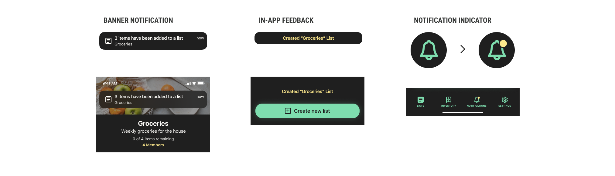
Adding more visual feedback to distinguish between actions taken by the user and changes made by collaborators within the app.

ONBOARDING
Adding this tutorial would allow users to more quickly grasp the core concept of the design. In the revised prototype, the tester would complete this process and then be instructed to perform the original tasks.

Adjusting to the user
While the user’s mental model did not follow the intended test process, I realized that their method was not incorrect. Following the logic of the app, adding an item to a list and crossing it off is one of the two methods of adding an item to the Inventory. You can also edit item details within the List screen. The most important revision was to have the prototype enable this method.
Adding visual feedback
Finally, three different visual cues were implemented to provide more feedback to the user and notify them of changes by other users.
Wrapping things up
With my insights from research and testing, I was able to gain a thorough understanding of my users which allowed me to iterate on my prototype to successfully create a viable product. I learned about how users shop for groceries and essentials and how they use technology to organize and keep track of their inventory within their household.
It was challenging to adjust my design to the expectations of my users. During testing, I found that the way I had envisioned my users engaging with the app did not align with the actual model those users employed. This was a great opportunity to learn how to pivot my design to reflect my users more accurately and I feel I did a good job at this. For future projects, I will be sure to observe my testers very closely to try and find ways in which I can adjust my designs to their expectations.
I am very proud of how this project turned out, especially the aspect of building a visual identity and applying it to an original design system. I very much enjoy creating components and variations of them for big projects. I hope to be able to create more systems like this in the future.