building a shopping site that users can trust
Developing responsive e-commerce

Background
Mirror started in 1994 as a clothing store targeting a budget-minded audience looking for low-cost clothing for any occasion. It offers quality merchandise at relatively low prices. Their main goal is to make any type of clothing accessible to everyone.
Mirror had an outdated informational website with no typical e-commerce functionality. As a UI and UX designer, I was tasked with updating Mirror’s brand identity, including a new logo, and researching and developing a design for a responsive online storefront.
Role
Research & UI/UX Design
Timeline
5 weeks, November - December 2021
Problem
Mirror is an established fashion retailer that is late in the game of digital storefronts. Because of this, customers opt to shop at other online stores for their clothing needs. Mirror wants to create a responsive online platform for shopping with a new logo and modern design.
Objective
Create an updated brand identity, including a new logo and design a responsive online storefront that will allow Mirror to get up to speed in the e-commerce market.
Identifying competitors and users
Initial research involved competitive analysis to discover what features are most common among competitors and what has and hasn’t been successful in the past.
Through this analysis, I found that:
Direct competitors in the e-commerce space use similar UX design philosophies; simple, visually engaging UI that guides users through larger product categories into narrowing degrees of specificity in their search for a particular item.
Key features in e-commerce web design include capable search functions and extensive filtering options.
Empathy Research
I wanted to know what users who shop online like and dislike about digital storefronts, their common pain points, and desires.
To do this, I interviewed 4 participants between the ages of 22 and 58, all with moderate to frequent online shopping experience.
Here are a few key insights that I found.
Online shopping creates uncertainty in several ways.
Quality and fit of clothing must be made clear to the customer before they commit to a purchase.
Certain common features in e-commerce help in creating clarity for users and reducing uncertainty.
User reviews are a deciding factor.
Sizing charts are necessary to identify proper measurements.
Variety of product images help users better visualize the items.
The users’ problem
Users dislike online clothes shopping because the uncertainty inherent in purchasing a product they cannot see or try on. It becomes difficult to determine how sizes are measured or how an item would look on them, therefore, the risk inherent in online shopping causes users to avoid it altogether.
Defining the website
Based on my interview subjects, I formed a provisional user persona that would help guide how I approached the design of the product. This persona provided me with a foundation off of which I would base all of my design decisions moving forward.
Determining structure
I conducted a card sorting exercise to establish a basic information structure for the website. The end result was the proposed sitemap seen here. This contained the basic levels of navigation that would be present on the website.

interaction design
During this step of the ideation process, I designed a general task flow based on my user persona for how I imagined the user would complete a specific task.

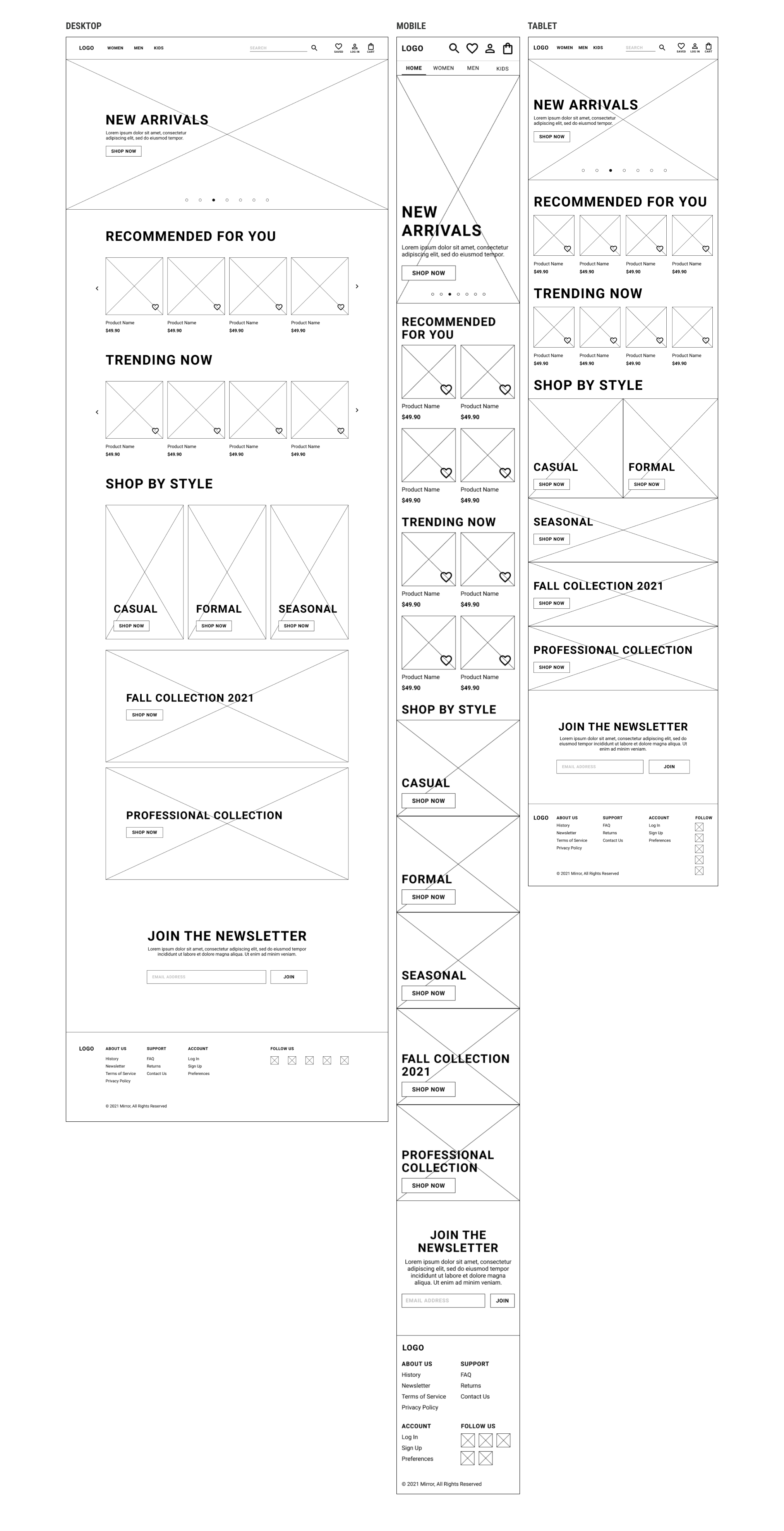
Designing a responsive homepage
Before developing branding and, eventually, a prototype for usability testing, I designed low-fidelity wireframes to establish the main backbone of the website’s design.
Here, I developed homepages for desktop, mobile, and tablet breakpoints.
I also mapped out a basic flow of how a user could get from the home screen to an item page on the desktop view. This would help me later when creating more high fidelity screens.
Branding and visual design
With the wireframes completed, a cohesive brand identity would be required to develop higher fidelity screens. This would include a logo, typography, a color scheme, and an overall design language that would be consistent all throughout.
Upgrading a brand
I developed a minimalist logo with two components that could work in conjunction and individually. This included a monogram and a wordmark. I chose a warm but pale color palette as well as simple, sans serif fonts that would convey a modern yet casual look.

The UI Kit
Developing a responsive UI kit required me to think of all the different breakpoints I was designing for. I needed to make sure my components were scalable to both desktop and mobile view.

ADAPTING INTO HIGH FIDELITY
Based on my wireframes, I applied my branding and UI kit to create a unique visual style and elevate my screens to a higher fidelity that would allow me to develop some testing flows for eventual usability testing.

Test flow
Thanks to the wireframes I created earlier, creating a prototype was simple. I made a testing flow that allowed for users to navigate via the header navigation into a catalogue page and then into an item page which would then allow them to add the item to their bag and check out. This would be the testers’ main task.

Conducting Usability Tests
Once the test flow was created, I recruited 5 participants, aged 25 to 60, to conduct said test and evaluate my design. Three usability tests were performed remotely and two in person. The participants were tasked with finding a specific item on the prototype and purchasing it.
Here I evaluated several things:
How the user locates the product.
How the easily is it for the user to modify the product parameters before adding to bag.
If the user can successfully complete the check-out process.
These would give me a clear idea of the overall quality of the design and its ease of use.
Key Findings
All participants were able to successfully find the assigned item, add it to their bag and check out.
2 of the 5 participants filled out most of the product parameters before adding it to their bag (color, size, quantity, fit). The product page did not require any fields to be completed to proceed.
This shows me that users rely heavily on visual feedback to know how to navigate a page.
All of the design elements in the design were utilized or interpreted correctly by the users.
Determining success of the design
This affinity map helped me in identifying successful and unsuccessful elements of the design both in its concept and in its ease of use. With this, I could determine what elements of the design could be improved upon:
Some elements of the visual design, such as text hierarchy in the navigation and a confusing use of color, made it somewhat difficult for users to parse the design properly.
Lack of error feedback caused some users to not mark input fields required in the main task.
All testers were successful in completing their tasks and praised the general direction of the design.

Iterating on user feedback
While the overall flow of navigation was successful, participants encountered some issues with the visual design of some elements in the prototype. The following adjustments were made to improve the design.
Modifying visuals
One minor change involved modifying the visual language of certain elements so they would communicate properly. Some testers remarked that the “red” color used to differentiate item prices was read as the item being discounted as this is a common practice in e-commerce.

Hierarchy within navigation
The hierarchy in the header navigation was difficult to parse for some users. The pink color, again, caused issues as it was seen as a secondary level of importance to the black color. The spacing between categories was reduced for those within the same upper level category to help this distinction.

Adding visual feedback
The design was modified to reflect proper behavior for a product page where it would be impossible to add the item to your bag without selecting required fields. To communicate this, the primary action button is deactivated until all required fields are selected.

Wrapping things up
With my insights from research and testing, I was able to gain a thorough understanding of my users which allowed me to iterate on my prototype to successfully create a viable product. I learned a lot about how users shop clothing online and the many difficulties this tends to bring.
The usability tests were a success in that they confirmed that my overall design approach was appropriate for the intended function of the website. User feedback was incredibly helpful in determining where my design fell short and what specific changes I could make to help my users overcome the challenges of online shopping.
I am very proud of how this project turned out, especially since it was my first time conducting user interviews and usability tests. This has established a good baseline of how I will approach these kinds of projects in the future.
