Creating a scalable visual language for wealth management
Rebuilding CircleBlack’s Design system
Context
CircleBlack is a digital wealth management platform designed for financial advisors and their clients to manage investment portfolios, performance reporting, and account data.
When I joined the team, the core product experience and visual system were already established. Rather than redesigning the platform from scratch, my responsibility was to evaluate, maintain, and iteratively improve an existing, data-heavy financial product used in real-world advisory workflows.
My work focused on improving usability, clarity, and consistency across key areas of the product while operating within regulatory, technical, and business constraints common to financial software. The primary challenge was improving usability and comprehension without disrupting user trust in a regulated financial environment.
Role
UX Designer / Product Designer
Platform
Web & Mobile Application
Time in this role
January 2023 - October 2025
Industry
Financial Services & Wealth Management
Project Timeline
October 2024 - December 2024
UX Challenges & Design focus
The primary users of CircleBlack were financial advisors who relied on the platform daily to review portfolios, communicate with clients, and make informed investment decisions. Because the product supported complex, high-stakes financial workflows, clarity, consistency, and user confidence were critical.
When I joined the team, several UX challenges were apparent:
Inconsistent component behavior and visual patterns across the product made it harder for advisors to build familiarity and trust.
The existing Sketch-based component library was overly complex and difficult to maintain, leading to inefficiencies in both design and development workflows.
As the sole designer, aligning feedback and priorities across multiple product managers was challenging, requiring careful design judgment and prioritization.
Given these constraints, my focus was not on visual reinvention, but on strengthening the underlying design system and improving usability through consistency, simplification, and clearer patterns.
Design system migration & Component Consistency
As the sole designer on the product, I was responsible for maintaining and evolving CircleBlack’s design system. One of my most impactful initiatives was migrating the component library from Sketch to Figma.
Rather than performing a direct transfer, I used the migration as an opportunity to evaluate the existing system and address long-standing usability and maintenance issues.
Before the migration:
The Sketch library contained a large number of redundant and overlapping components
Variants were inconsistently structured, making reuse difficult
Limited documentation made it harder to apply patterns consistently across the product
Approach & Improvements:
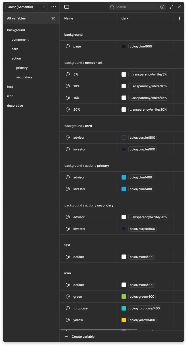
Using Figma’s component properties, variable system, and shared libraries, I:
Consolidated redundant components into flexible, reusable patterns
Introduced clear variant structures to reduce ambiguity and design debt
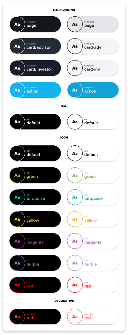
Standardized spacing, typography, and interaction behaviors across core components
Added lightweight documentation to clarify usage and intent
Outcome:
This work resulted in a simpler, more scalable design system that supported faster iteration, improved consistency across the product, and reduced friction when collaborating with product managers and engineers. For end users, this translated into a more predictable and trustworthy experience when working with complex financial data.
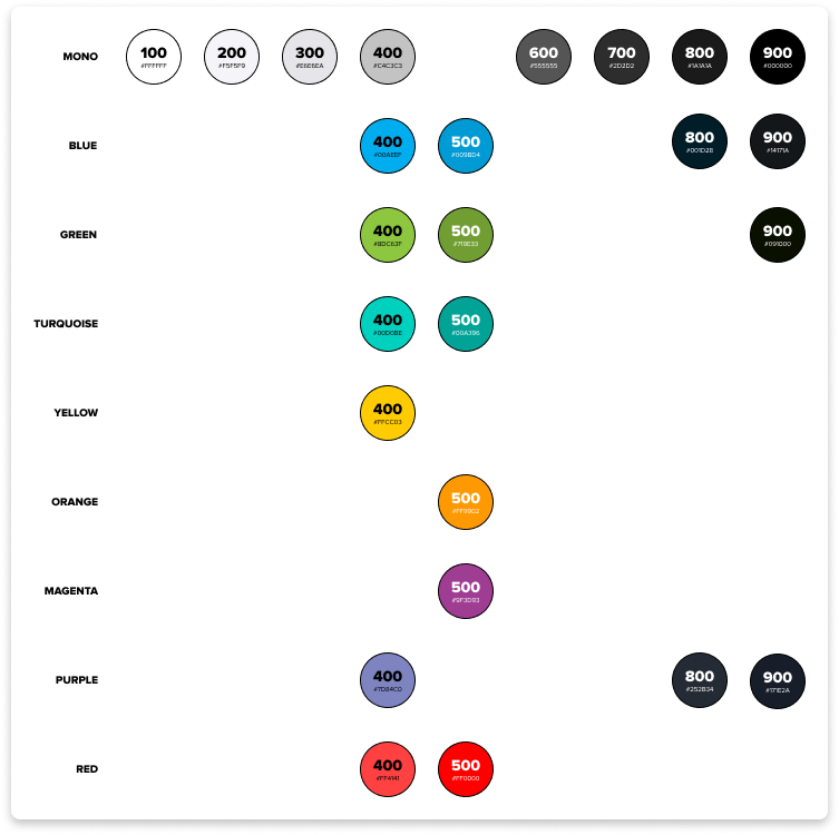
A new minimized color palette was developed and established which accounted for accessibility and user customization.
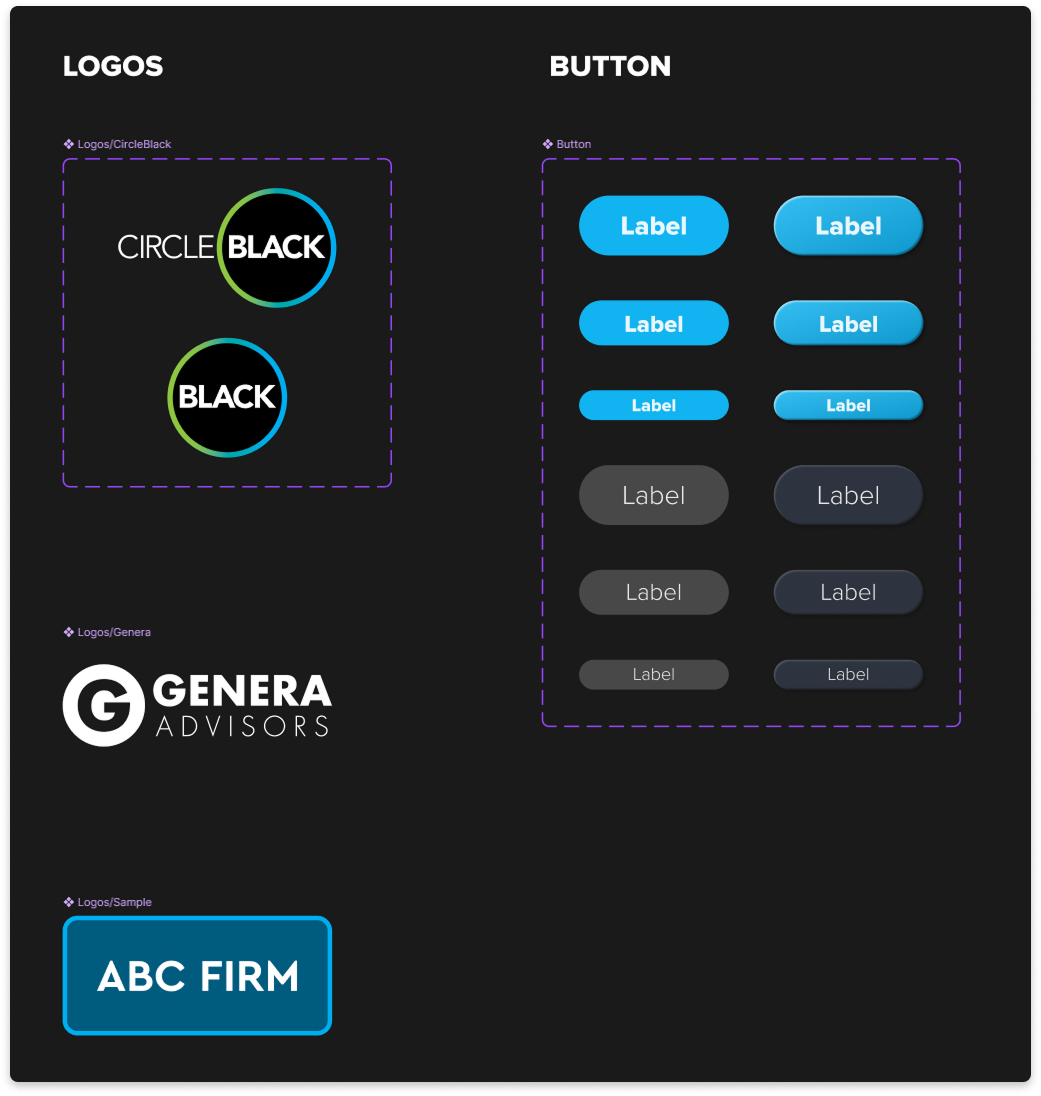
Example of component consolidation during the Sketch → Figma migration